
Scientific Investigations: Recording and Concluding
Scientific Investigations: Recording and Concluding
At the end of this lesson, you are expected to:
Identify patterns and trends in your collected data.
Interpret what your data reveals about your investigation's question or hypothesis.
Understand the importance of accurate data analysis in scientific investigations.
Explain how simple calculations like finding the average can help understand data.
Imagine you're a detective, and someone has taken the last cookie from the cookie jar! You found some clues:
Clue 1: There are crumbs on the floor leading from the kitchen to the living room.
Clue 2: Your little brother has chocolate smudges on his face.
Clue 3: Your dog, who loves cookies, is fast asleep in his bed.
Now, look at these clues. Which clue is the strongest evidence that your brother took the cookie? Why?
Think about how you used the clues to figure out what happened. In science, we also collect "clues" (which we call data) and then we have to figure out what they mean! This is what we'll be learning about today: how to make sense of the data we collect.
Welcome, young scientists! You've done a fantastic job planning your investigations, gathering your materials, carefully following the steps, and recording all your observations and measurements. You've collected your "clues," which we call data. But what do all those numbers and notes mean? That's where data analysis comes in! Analyzing data is like being a detective for your experiment. You look at all the clues (your data) to solve the mystery (answer your question or test your hypothesis).
What is Data Analysis?
Data analysis is the process of cleaning, transforming, and modeling data to discover useful information, draw conclusions, and support decision-making. For us, it means looking closely at the information we wrote down in our science notebooks to understand what happened in our experiment.
Why is Analyzing Data Important?
Imagine you did an experiment to see if plants grow taller with more sunlight. You measured your plants every day for a week and wrote down the heights. If you just look at your notebook without organizing or comparing the numbers, it's hard to tell if the plant with more sun really grew taller. Analyzing the data helps us:
See Patterns: Are the numbers going up, down, or staying the same?
Find Relationships: Does one thing (like more sunlight) seem to cause another thing (like taller plants)?
Draw Conclusions: Based on the patterns, what can we say about our original question or guess (hypothesis)?
Share Our Findings: We can tell others what we discovered!
Types of Data We Collect
In our Grade 7 science investigations, we often collect two main types of data:
Qualitative Data: This is descriptive information that isn't measured with numbers. It's about qualities or characteristics.
Examples: The color of a solution, the smell of a substance, the texture of a material, whether a reaction produced bubbles, or observations like "the plant looked healthier."
How to Analyze: Look for common descriptions, group similar observations, and describe the overall quality. For instance, if you tested different soils for plant growth, you might note which soil made the plants look "greenest" or "most vibrant."
Quantitative Data: This is numerical data that can be measured.
Examples: The height of a plant in centimeters, the temperature of water in degrees Celsius, the time it takes for something to dissolve in seconds, the mass of an object in grams.
How to Analyze: This is where we look for patterns and use simple math. We can organize it in tables, create graphs, and calculate things like averages.
Organizing Your Data: Making it Easy to See!
Before you can analyze your data, you need to organize it. You've probably already done this by creating tables in your notebook. Let's revisit why tables are so helpful.
Example: The Solubility Experiment
Let's say you did an experiment to see how much sugar dissolves in water at different temperatures. You followed these steps:
Aim: To find out if temperature affects how much sugar dissolves in water.
Materials: Water, sugar, beakers, thermometer, stirring rod, measuring cup, measuring spoon, heat source (like a hot plate or stove - with adult supervision!), ice.
Method:
Measure 100 mL of water into three separate beakers.
Beaker 1 (Cold): Put the beaker in an ice bath until the water is about 10°C.
Beaker 2 (Room Temp): Let the water stay at room temperature (about 25°C).
Beaker 3 (Hot): Gently heat the water until it is about 60°C. Use a thermometer to check.
In each beaker, add one spoonful of sugar at a time, stirring well after each spoonful, until no more sugar dissolves.
Count how many spoonfuls of sugar dissolved in each beaker.
Results (What you recorded):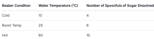
Analyzing the Organized Data
Now, look at the table above. What do you notice?
Pattern Recognition: Can you see a pattern? As the temperature of the water increased, the number of sugar spoonfuls that dissolved also increased.
Relationship: This suggests there's a relationship between water temperature and how much sugar can dissolve. Warmer water seems to dissolve more sugar.
Answering the Aim: Does this data help answer our aim? Yes! It shows that temperature does affect how much sugar dissolves in water.
Introducing the Average: Finding the "Typical" Value
Sometimes, you might repeat a measurement a few times to make sure it's accurate. For example, maybe you repeated the sugar experiment three times for each temperature. You might get results like this:
Cold Water (10°C): 4 spoonfuls, 5 spoonfuls, 4 spoonfuls
Room Temp Water (25°C): 6 spoonfuls, 7 spoonfuls, 6 spoonfuls
Hot Water (60°C): 10 spoonfuls, 11 spoonfuls, 10 spoonfuls
How do we get a single, reliable number for each temperature? We calculate the average (or mean)!
How to Calculate an Average:
Add up all the numbers in a set.
Divide that sum by the total count of numbers in the set.
Let's calculate the average for the cold water:
Add the numbers: 4 + 5 + 4 = 13
Count how many numbers there are: 3
Divide the sum by the count: 13 ÷ 3 = 4.33 (approximately)
So, the average number of spoonfuls dissolved in cold water is about 4.33. You would do the same for room temperature and hot water.
Why use an average? It helps smooth out any small differences or errors that might have happened during the experiment, giving you a more reliable result.
Visualizing Data: Graphs!
Sometimes, numbers can be hard to understand just by looking at a table. Graphs are like pictures of your data that make patterns super clear!
For our sugar experiment, a bar graph would be perfect.
X-axis (the bottom line): This would show the different temperatures (Cold, Room Temp, Hot).
Y-axis (the side line): This would show the number of spoonfuls dissolved.
You would draw a bar for each temperature, with the height of the bar matching the number of spoonfuls dissolved (or the average, if you calculated it).
(Imagine a simple bar graph here: a short bar for Cold, a medium bar for Room Temp, and a tall bar for Hot, all going up from the bottom line.)
Looking at this bar graph, you can instantly see that the "Hot" bar is the tallest, showing that the most sugar dissolved at the highest temperature. It's much easier to see the trend this way!
Other Types of Graphs:
Line Graph: Used to show how something changes over time. For example, if you were tracking the temperature of water as it heated up, you'd use a line graph.
Pie Chart: Used to show parts of a whole, like the percentage of different gases in the air.
Interpreting Your Results: What Does it All Mean?
After organizing and visualizing your data, the final step is to interpret it. This means explaining what your data tells you in relation to your original question or hypothesis.
Let's go back to our plant experiment (more sunlight = taller plants?).
Hypothesis: Plants given more sunlight will grow taller than plants given less sunlight.
Data (simplified):
Plant A (Lots of Sun): Grew 15 cm in a week.
Plant B (Little Sun): Grew 8 cm in a week.
Analysis: Plant A grew 7 cm taller than Plant B. The data shows a clear difference in growth based on the amount of sunlight.
Conclusion: The results support the hypothesis. Plants grow taller when they receive more sunlight.
Connecting to Your Investigation Steps:
Remember the steps of a scientific investigation? Analyzing results is step (d) Results/Data and leads directly to step (e) Conclusion.
Results/Data: This is where you present your organized data (tables, graphs).
Conclusion: This is where you explain what your data means. You state whether your hypothesis was supported or not, and you use your data as evidence.
Example Conclusion:
"My investigation aimed to see if temperature affects how much sugar dissolves in water. My data showed that at 10°C, 4 spoonfuls dissolved; at 25°C, 6 spoonfuls dissolved; and at 60°C, 10 spoonfuls dissolved. This data supports my hypothesis because as the water temperature increased, the amount of sugar that dissolved also increased. Warmer water can hold more dissolved sugar."
Important Considerations When Analyzing Data:
Accuracy: Double-check your measurements and calculations. Did you record the numbers correctly? Did you add and divide correctly?
Units: Always include the units (cm, °C, seconds, grams) when you talk about your measurements.
Fair Test: Did you keep everything else the same (controlled variables) while changing only the one thing you were testing (independent variable)? If not, your results might be misleading. For example, if the "little sun" plant also got less water, you wouldn't know if the lack of growth was due to sun or water.
Repetition: Doing an experiment more than once (like we did with the spoonfuls) makes your results more reliable.
Let's Think About Another Example: Dissolving Salt
Suppose you investigated how fast salt dissolves in water at different stirring speeds.
Aim: To determine if stirring speed affects how quickly salt dissolves.
Hypothesis: Stirring the water faster will make the salt dissolve more quickly.
Data Collected (Time in seconds for salt to dissolve):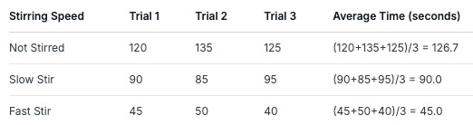
Analysis:
Pattern: The time it took for the salt to dissolve decreased as the stirring speed increased.
Average: The average times show a clear trend: 126.7 seconds (no stir), 90.0 seconds (slow stir), 45.0 seconds (fast stir).
Graph: A bar graph or even a line graph (if you assigned numbers to speeds like 0, 1, 2) would clearly show this decrease in time.
Conclusion: The data supports the hypothesis. Stirring the water faster makes the salt dissolve more quickly because stirring helps move the dissolved salt away from the salt crystals and brings fresh water to them, speeding up the dissolving process.
Key Takeaway: Analyzing data transforms raw numbers and observations into meaningful information that helps us understand the world around us and answer our scientific questions. It's the bridge between collecting evidence and drawing a conclusion.
Guided Practice: Analyzing Our Own Data
Let's pretend we did an experiment about how different liquids affect the rusting of iron nails. We put one iron nail in each of these liquids for one week:
Tap Water
Salt Water (like our salt experiment, but with a nail!)
Vinegar (an acid)
We observed the nails and recorded our findings (qualitative data).
Our (Imaginary) Observations:
Nail in Tap Water: A little bit of rust formed on the nail. It looked slightly orange-brown.
Nail in Salt Water: A lot of rust formed on the nail. It was covered in thick, orange-brown rust.
Nail in Vinegar: The nail seemed to get a bit smoother, and there was some bubbling. There was also some rust, but maybe less than the salt water, and the liquid turned cloudy.
Now, let's analyze this qualitative data:
Compare: Which liquid caused the most rust? (Salt Water)
Compare: Which liquid caused the least rust? (Tap Water)
Describe: What was different about the nail in vinegar besides rust? (Bubbling, cloudy liquid)
Relate to Concepts: We learned that salt water can speed up reactions. Does our data support this? (Yes, the most rust was in salt water). We also learned about acids. Vinegar is an acid. Acids can react with metals. Does our data show a reaction? (Yes, bubbling and cloudiness).
Conclusion Statement: Based on these observations, salt water caused the iron nail to rust the most, while tap water caused the least rust. Vinegar also caused rusting, along with other reactions like bubbling, indicating it is chemically active.
Interactive Activity: Graphing Challenge!
Let's use the data from our sugar solubility experiment. Imagine we have the average spoonfuls dissolved:
Cold Water (10°C): 4.33 spoonfuls
Room Temp Water (25°C): 6.00 spoonfuls
Hot Water (60°C): 10.00 spoonfuls
Your Task:
Draw a simple bar graph on a piece of paper or use a digital tool if available.
Label the bottom axis (X-axis) with "Water Temperature (°C)" and write "10°C", "25°C", and "60°C" under it.
Label the side axis (Y-axis) with "Spoonfuls of Sugar Dissolved" and mark numbers like 0, 2, 4, 6, 8, 10, 12.
Draw a bar for each temperature, making sure the height of the bar matches the number of spoonfuls dissolved.
Look at your finished graph. What does it clearly show about the relationship between temperature and sugar solubility? Write one sentence explaining this.
Independent Practice: Analyzing Your Own Investigation Data
Think back to an investigation you have already completed or one you are currently working on.
Review Your Data: Look at the tables or notes where you recorded your results.
Identify Patterns: Are there any clear trends? Do the numbers increase, decrease, or stay the same?
Calculate Averages (if applicable): If you have multiple measurements for the same condition, calculate the average.
Visualize (Optional but Recommended): Try to sketch a simple graph (bar graph, line graph) of your data.
Write a Conclusion: Based on your data analysis, write a conclusion that answers your investigation's question or addresses your hypothesis. Use your data as evidence! For example: "My investigation tested [your aim]. My data showed that [describe pattern or average]. This supports my hypothesis that [state hypothesis] because [explain using data]."
Weather Forecasting: Meteorologists collect vast amounts of data every day – temperature, wind speed, humidity, air pressure. They use computers to analyze this data, looking for patterns and trends. This analysis helps them create weather forecasts, predicting if it will rain, be sunny, or if a storm is coming. Without analyzing data, we wouldn't know what to expect from the weather!
Medicine: Doctors and scientists analyze data from medical tests and studies. For example, they might track how many patients recover when given a new medicine compared to a placebo (a fake medicine). By analyzing this data, they can determine if the medicine is effective and safe to use. They look for patterns in recovery rates, side effects, and other health indicators.
Data analysis is like being a detective for your experiment, helping you understand what your collected information means.
Organizing data in tables makes it easier to see patterns.
Graphs are visual tools that help us understand data trends quickly.
Calculating averages can give us a more reliable number when we have multiple measurements.
Analyzing data helps us draw conclusions and determine if our hypothesis was supported.
We must always consider accuracy, units, and fair testing when analyzing results.
When I conduct a science experiment, I will carefully organize my data in tables.
I will look for patterns and trends in my data after I collect it.
If I have multiple measurements, I will try to calculate the average to get a better understanding.
I will try to create a simple graph to visualize my results.
I will use my analyzed data to write a clear conclusion that answers my investigation's question.
I will remember to check my work for accuracy and use the correct units.
No Comments Yet